Friday, July 28, 2006
high on hayon
“My idea was to create a modular system that responds to the functionality of the living room. Shown here are four units side by side, but they can also be stacked on top of one another up to three units high.”“At the beginning I really believed in the cleanness of having four legs on a long piece of furniture. But as more and more legs were required to support the stacking units, I finally just said, “Let’s use them all!” The dozen different legs are also configurable; they screw in and out of the bottom of the cabinet. It’s really random, which I like. It leaves space for the imagination of the user.” JAIME HAYON www.hayonstudio.com
Tuesday, July 25, 2006
Wednesday, July 12, 2006
positive effect
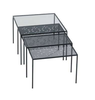
the polar nesting table debuted at the recently concluded milan furniture fair. designed by tokyo-based nendo for the scandinavian company swedese, the table seems deceivingly simple yet the 'wow' lies on the glass tops. each glass panel is laminated with polarized film that produce light or dark floral patterns depending on how the tables are rotated when they nest. the bases are finished in an ebonized lacquer finish.
the top photo shows a set of table, bench and stool seating in laminated, oiled oak also from swedese and designed by naoto fukasawa.
more: www.swedese.se
Monday, July 10, 2006
brabus bravura!
this might be old news to the car enthusiasts out there, but it was fresh news to me when i stumbled upon this bit a day ago, so i am posting just the same :)
in november 2005, brabus unveiled the conceptual smart forfour vehicle at the essen motorshow. it's a first in many ways and it seems to me that the overall design imbues familiarity and is without too much of a 'concept' stigma, if you know what i mean. certainly different from another benz model that had a brief showing at the just concluded davinci movie.
more here: http://emercedesbenz.com/Nov05/25BrabusUnveilsSmartAtEssenShow.html
Saturday, July 08, 2006
dutch wrap
the 'artist' behind these photos is none other than dutch designer jurgen bey whose namesake studio was established in 1998 (www.jurgenbey.nl). bey had first gained acclaim through the phenomenal droog design outfit which featured his earlier works, including the now famous tree trunk bench which philippe starck had used in an ian schrager hotel project.
bey was commissioned by jean paul gaultier in 2003 to work on the fashion designer's kokon stage exhibition (second photo above) in which eventually was duplicated in gaultier's flagship store in paris. the designer's innovative and conceptual treatment in product and interior design has also earned him a permanent installation commission (the day tripper bench) at the upscale roppongi hills in tokyo for droog design.
Thursday, July 06, 2006
john not emily
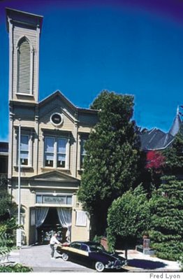
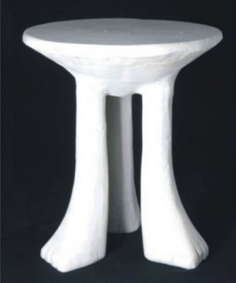
john dickinson has finally caught our attention. again. perhaps the original l'enfante terrible of interior design of the 70's, dickinson could easily be depicted as a pop icon ala wharhol. born in berkeley and trained at parsons school of design in new york, dickinson returned to san francisco to establish his design practice in 1956. he lived on washington street in sf in what used to be a firehouse (see photo above) and cruised the streets of san francisco in his cane-cladded jaguar.
alongside maria pergay, gabriela crespi, and paul evans, to name a few, furnishings from the seventies have become sought after works of 'art' these days. is this a sign that mid-century modern is out of vogue? is it really time to thank your noguchi tables, saarinen tulips, eames what-nots, and say hello to the 70s? i can almost imagine john's grin of approval.
read more: http://www.departures.com/ad/ad_0306_70slook.html
Wednesday, July 05, 2006
french connection
great designers are not made overnight. under the tutelage of a great mentor, a novice designer's sheer skill and talent are nurtured and instinctively honed. in fashion, giorgio armani worked under the watchful eyes of gianfranco ferre, donna karan bloomed under the wings of erstwhile dame of fashion, ann klein. the list goes on.
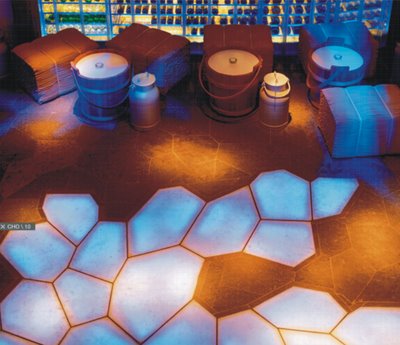
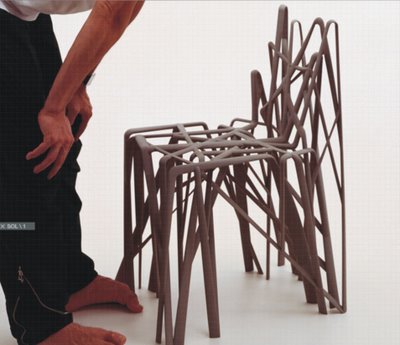
enter patrick jouin. talented in his own right, this designer-at-large had trained and worked with one of the best. he worked for philippe starck. as his c.v. states in his own website www.patrickjouin.com, the designer had worked with starck from 1992 to 1999, collaborating initially with thomson media and then working full-time at starck's own studio. however, jouin's prominence in the field of design solidified with the launching of his SOLID furniture line at the maison et object show in paris in 2004. what set him apart from the other exhibitors, aside from the superfluos appeal of his work, is the manufacturing process which he took in building the furniture. the process was non-traditional and pioneering in many ways. dubbed as stereolithography, whereby the manufacturing information is digitally processed then a laser machine is used to 'sculpt' the details, the result is astoundingly out-of-this-world to say the least.
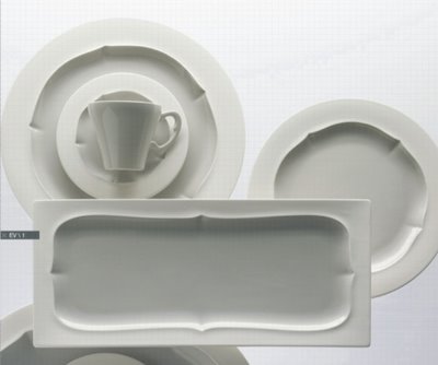
the above photos show jouin's versatility in design: top photo is a shot of the interior of a nightclub cum restaurant called chlosterli in switzerland; bottom photo is an earthenware collection jouin designed for the company gien, middle photo is the designer with his solid creation.
Tuesday, July 04, 2006
creative excess?
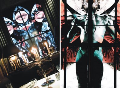
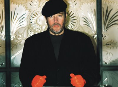
the eponymous 'creative conglomerate' monsieur philippe had just wrapped up his third bon restaurant, in moscow. having teamed up with the billionaire boys of moscow (a staid watering hole outfit owned by friends), the irreverent aging prince of avant garde have critics frowning over his overly-covetous creation. the theme is sex, violence and food: the new russian trinity as described in an article via yankodesign.
read more: http://www.elementmoscow.ru/articles.php?i=150000&s=07-deep-dish
Monday, July 03, 2006
burning desire
maarten baas and bas den herder are the boys behind studio maarten baas. their 'smoke' furniture collection debuted amidst raised eyebrows...although oohs and ahhs, i surmise, would've been to the trained eye attendees. surely, these guys are the new wanders, urquiola and bouroullec of the coming years.
the process is mundane: furniture pieces are burned and then carefully preserved by applying clear epoxy. the result is an unusual blackened finish that is bespoke and akin to a nevelson masterpiece.
avant garde, irreverently chic, but fab nonetheless.
an interesting read via washington post:
http://www.washingtonpost.com/wp-dyn/articles/A46764-2004May21.html
link: www.maartenbaas.com
new antiques
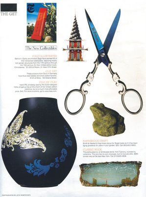
cheap but good? according to a recent THE GET feature on new york times' STYLE magazine, the above pictured objet d' art ensemble are certified 'collectible'.
the vase is from ikea's ps line, for 40 bucks. the solingen scissors from moss, for $125. the frog moss-statue from smith and hawken for $20. the dams and zega book compilation for $1k at rizzoli.
while i was typing out this piece and thinking of a title, i thought about going with "goodwill" hunting (with reference to the popular thrift shop) or 'new antiques' but couldn't decide. and so i tossed a coin, hence, i went with the latter....happy 4th.
de young...the restless
the newly opened m.h. de young museum had long been anticipated as san francisco's landmark architecture for the new millenium. it's another feather on the cap for the swiss duo, architects herzog and de meuron.
visitors are all agog over the shimmery copper-cladded structure that to my mind is reminiscent of a pseudo flw ouvre.
guaranteed kid-approved.
de young link: www.thinker.org/deyoung/index.asp
Subscribe to:
Posts (Atom)